
After popping up in the collections of designers from Chanel to Chloé, the colour is now seeing a resurgence in interior design
All products featured on Vogue are independently selected by our editors. However, when you buy something through our retail links, we may earn an affiliate commission.
Ever since Louis Vuitton sent butter yellow down their spring/summer '24 runway, the colour has been inescapable. There it was on Hailey Bieber, in the form of a Jacquemus dress, for her baby shower. There it was on Sabrina Carpenter, as she performed at Governor’s Ball and again as walked the carpet at the Variety Power of Young Hollywood event in a sparkly Miu Miu gown. There it was on Timothée Chalamet at the 2025 Academy Awards — days before it popped up in the collections of Chloé, Chanel, and Sarah Burton’s debut for Givenchy.
And now, it turns out, butter yellow might not just be hanging in your closet — but in your home itself.

The downstairs “apartment” of Sam McKinniss's home in Kent, Connecticut. Painting by Sam McKinniss, Mother and Calf, 2022, oil on linen. Vogue, Winter 2025. Photo: Stefan Ruiz
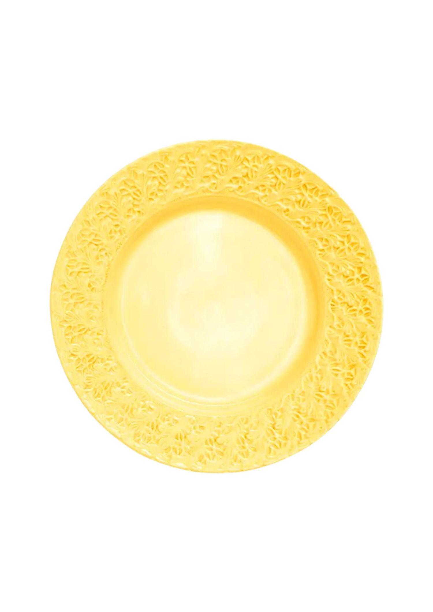
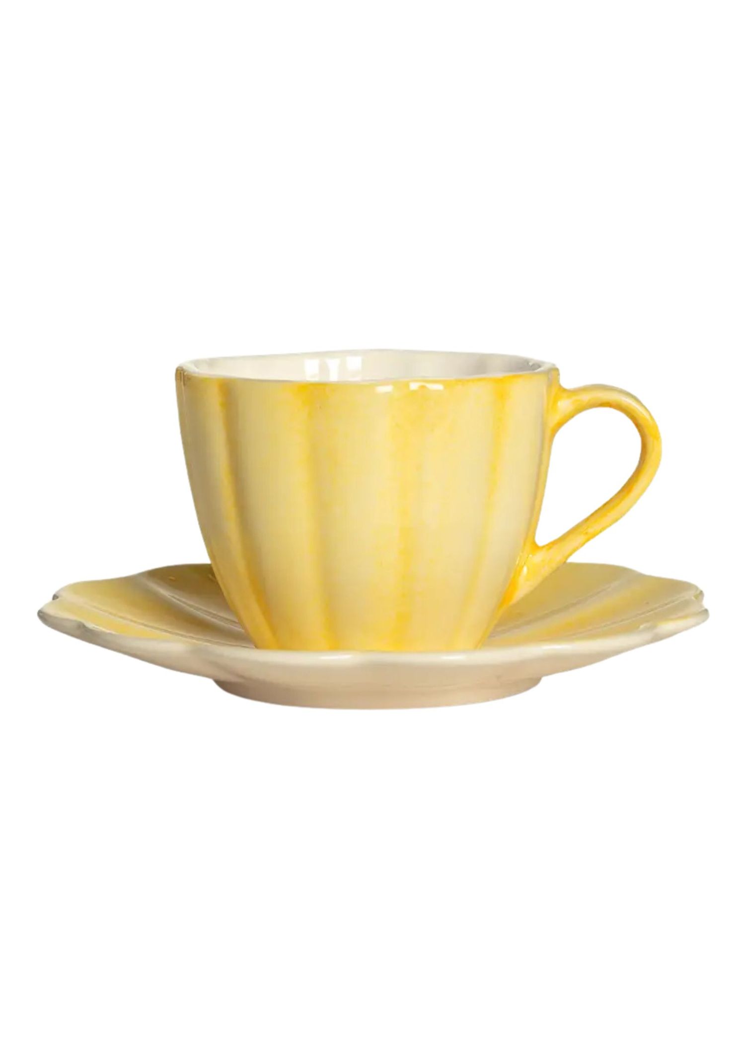
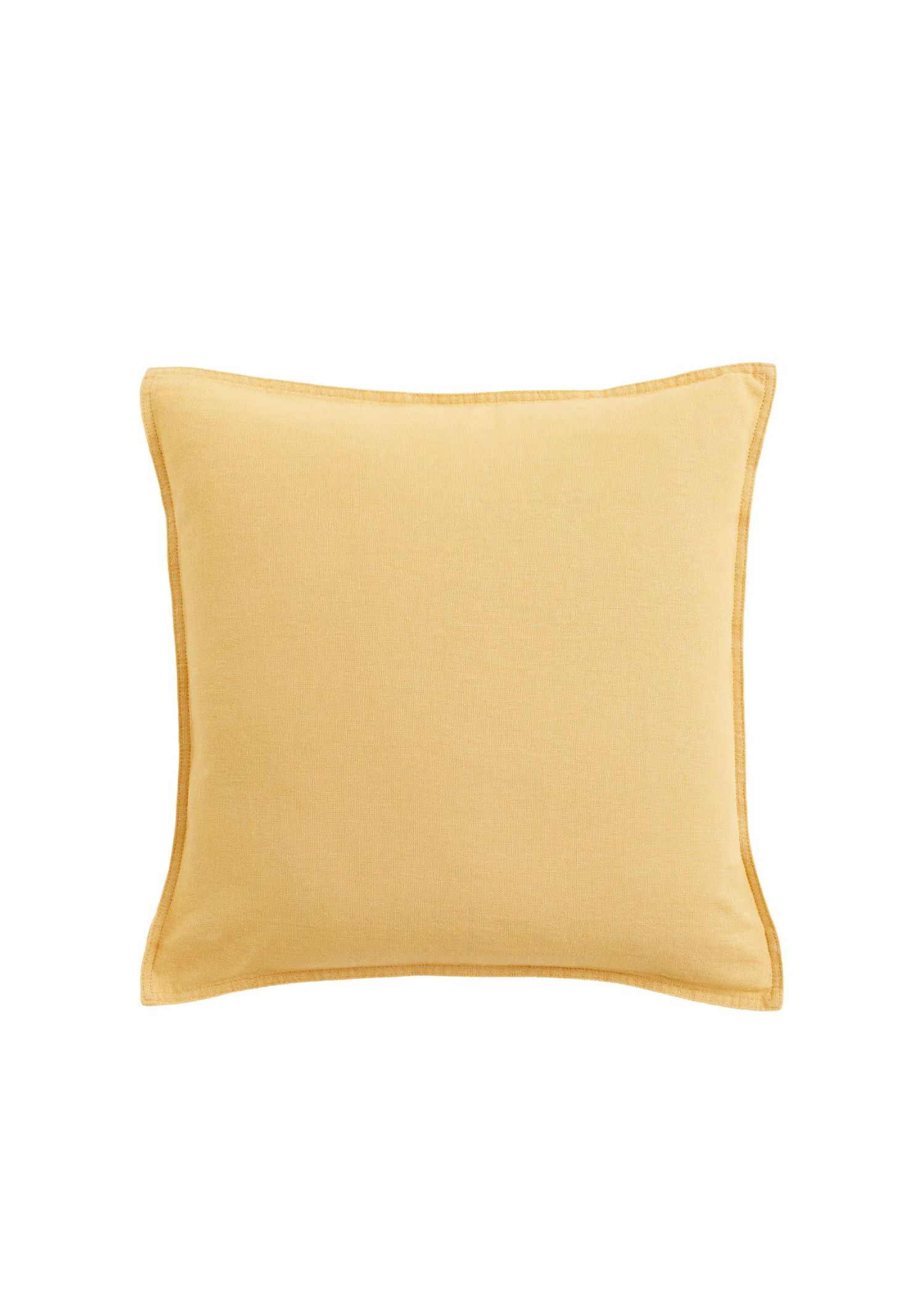
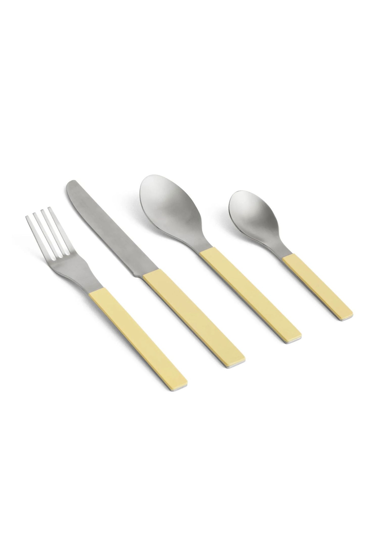
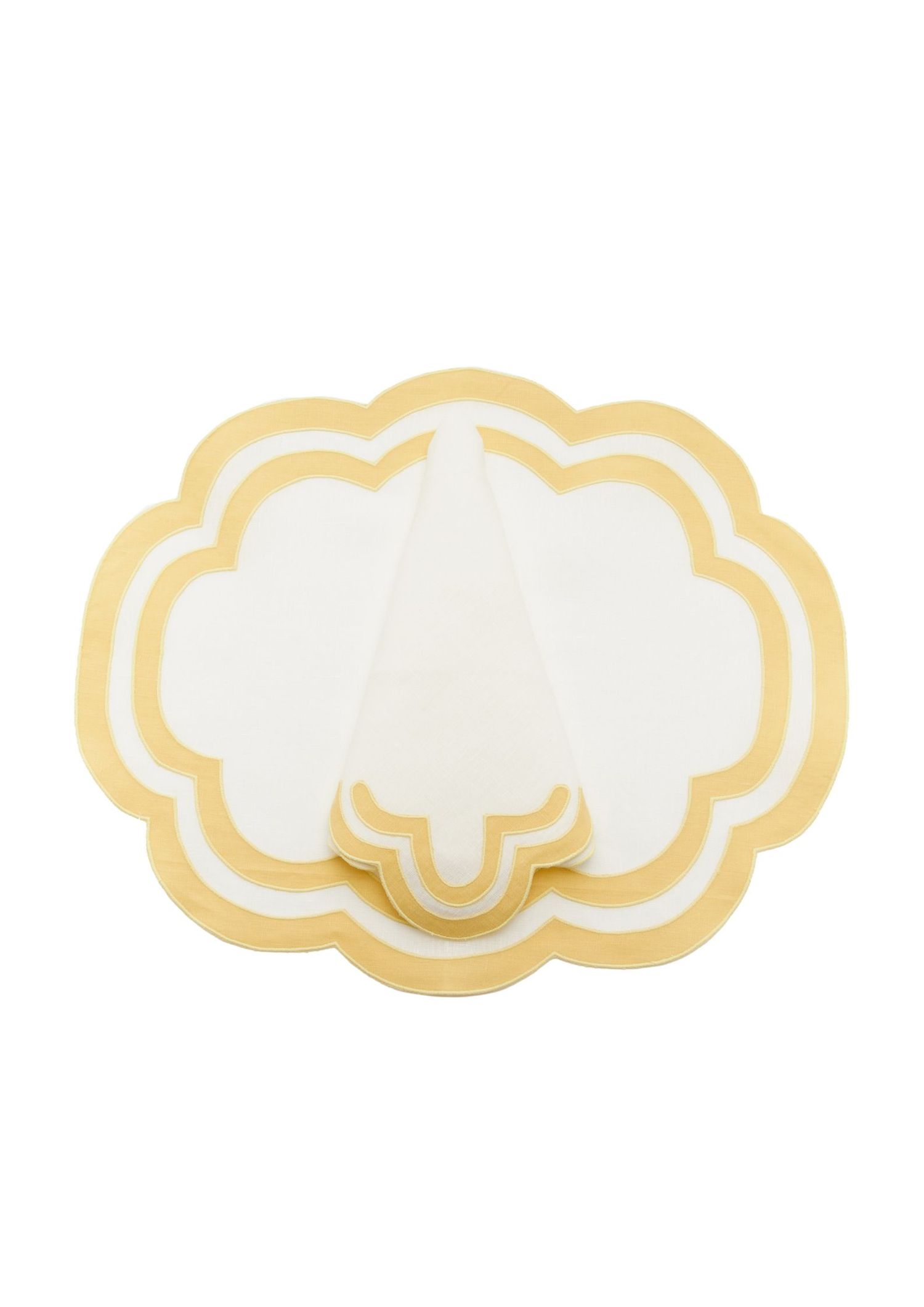
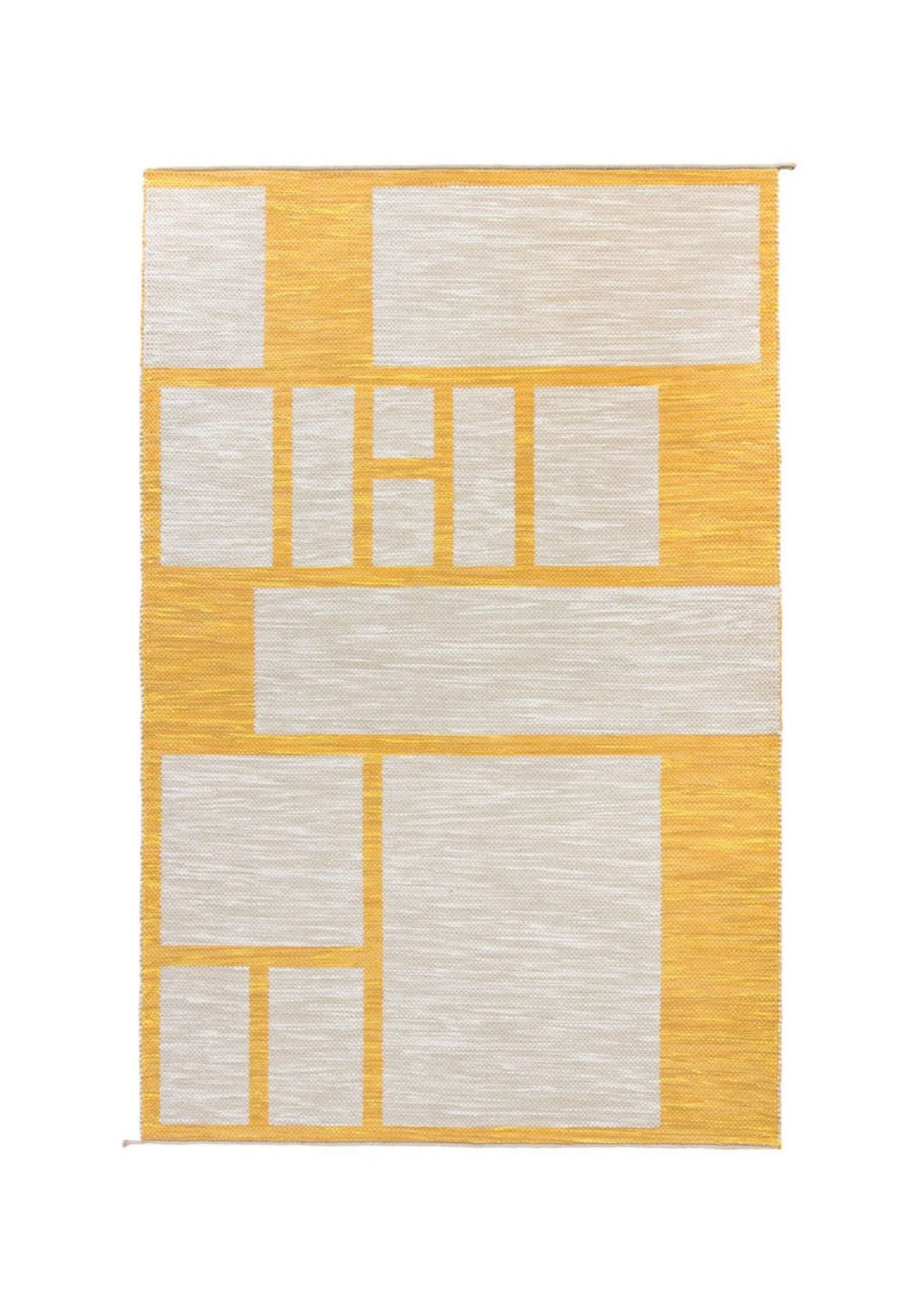
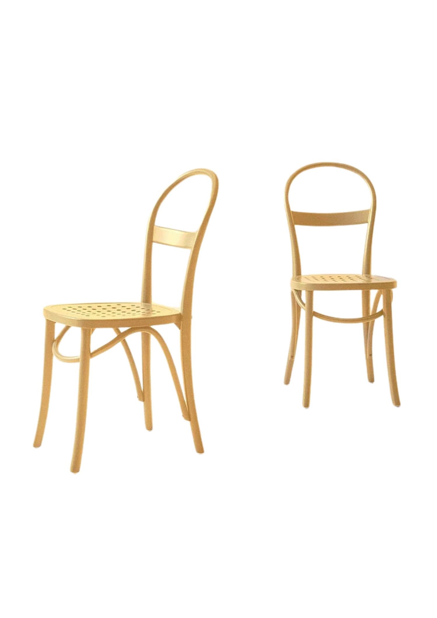
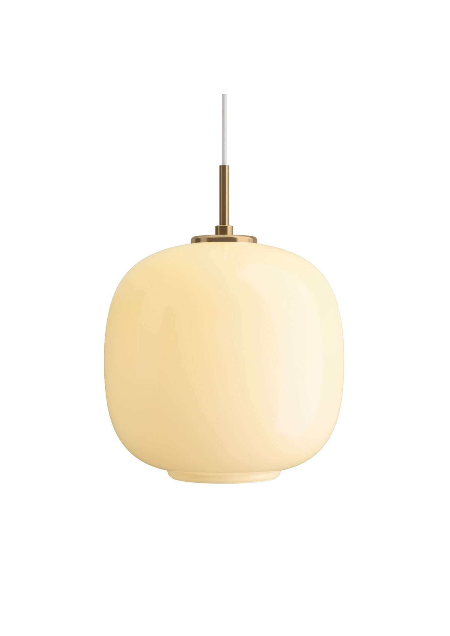
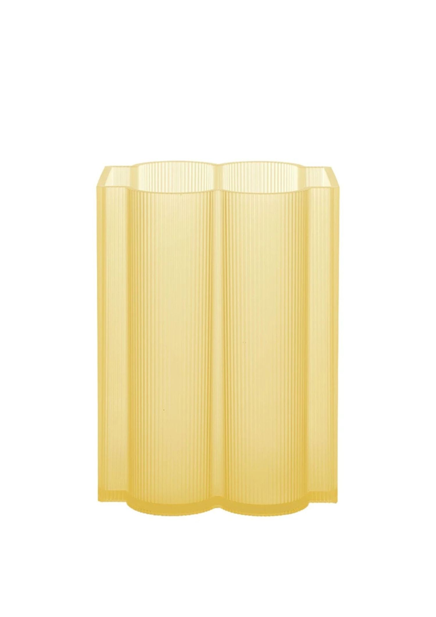
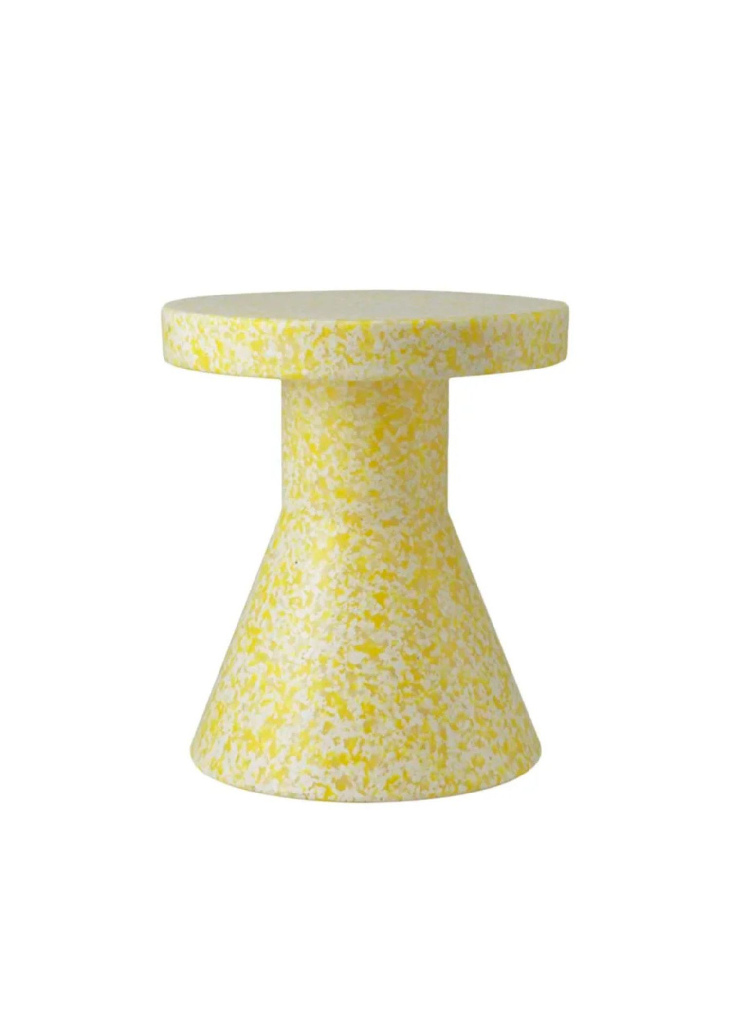
Multiple interior designers tell Vogue that they’re seeing an uptick in interest around butter yellow furniture, paints, wallpapers, and accents — AD100 designers Timothy Corrigan, Heidi Callier and Robin Standefer all named it as the colour of 2025 in Vogue’s annual interior design trend report. Industry experts, too: “Yellow has been gaining momentum in fashion in recent seasons, with fashion brands like Louis Vuitton and Burberry embracing it in their collections. This trend is now making its way into home interiors, and we’re excited to see it shine in some special pieces,” says Andrea Erman, CB2’s senior director of design and development. The e-retailer has added more and more products that contain the hue — and one, a butter-yellow-and-black rug, quickly became a best-seller.

A living room with butter yellow accents by McGrath II. Photo: William Waldron
It makes sense. Fashion and interiors have long influenced each other’s colour palettes: oxblood, for example, is also having a home decor moment, whereas Art Deco architecture impacted both clothing and jewellery in the 1920s. Yet butter yellow’s newfound popularity can’t only be traced back to clothes.
Corrigan points to an emotional reason as well. Our brain inherently associates yellow with happiness: it’s the colour of sunshine, warmth, and spring flowers. And, as the world feels uncertain for many, being surrounded by such a shade brings a sense of comfort.
Yellow is a cheerful colour that evokes joy and optimism, feelings we can never have enough of, especially during these turbulent times.
Andrea Erman, CB2’s senior director of design and development

Photo: Haris Kenjar
“Yellow is a cheerful colour that evokes joy and optimism, feelings we can never have enough of, especially during these turbulent times,” he says. Erman agrees: “Yellow is more than just a colour,” she says. “It’s a state of mind. We naturally respond to sunlight with increased energy and vitality, and incorporating yellow into our living spaces can create a similar effect. Butter yellow adds a grounded, comforting warmth, balancing energy with a peaceful, welcoming atmosphere.”
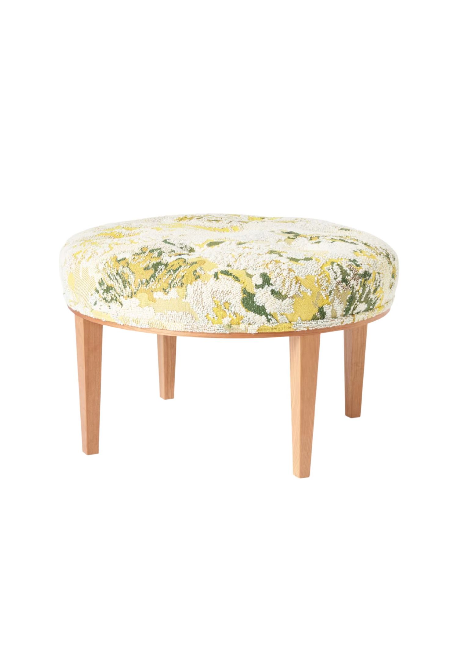
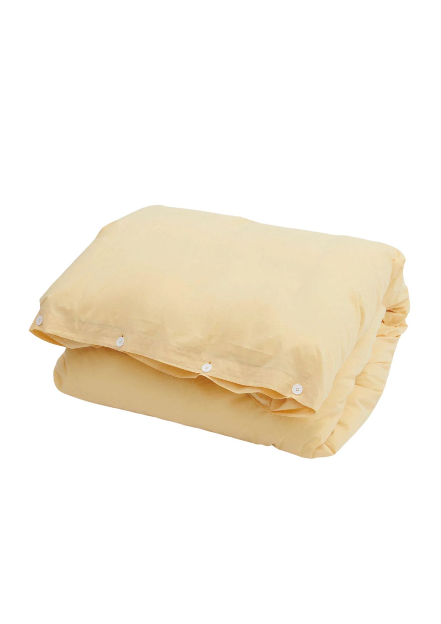
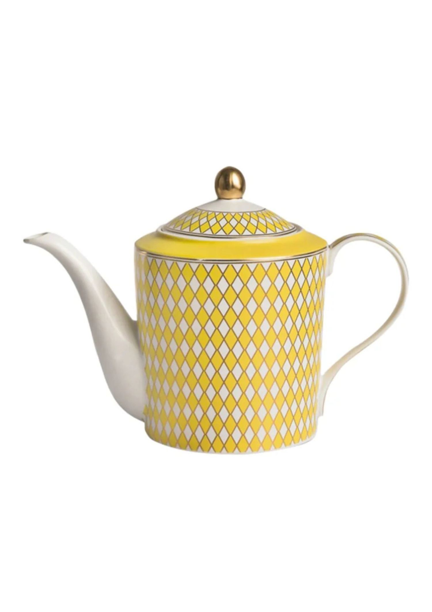
It’s also fairly easy to incorporate into any interior space. While bolder hues may clash with the decor one already has in their home, yellow can be woven in more effortlessly. Callier, in particular, notes the shade’s ability to complement nearly every colour scheme. “It looks amazing paired with shades of blue, green, red, neutrals; it feels daring yet it is actually very versatile,” she says. Where other shades in the yellow colour wheel — like lemon, citrine, or gold — can really pop, butter yellow is a pastel that is easy on the eyes and blends into the background, making it the perfect shade for those curious about colour drenching.

A Berkshires kitchen with butter yellow counters by McGrath II. Photo: William Wadron
Currently, Callier is working on a butter yellow bunkroom for a home in Seattle. Corrigan, too, has embraced the colour. He covered the walls in a client’s London townhouse in a yellow damask in order to create a sunny ambience for a north-facing room that traditionally doesn’t receive much sunlight. Then, at his home in France, he painted his salon in the sunny hue.
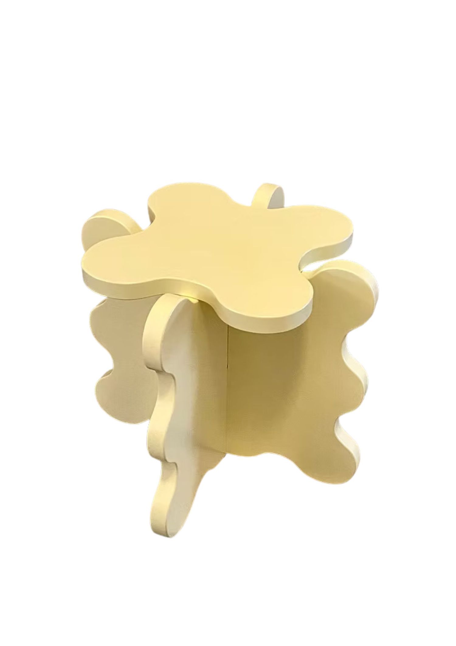
And those are just examples of rooms defined by butter yellow. Both Corrigan and Callier point out its power as an accent. “I love it in a floral print for a sofa or accent chair, within a stripe for a drape, and as a focal color in a nature patterned wallpaper,” says Callier, while Corrigan embraces it as a textile: “I also love using it on bed hangings and curtains to evoke the feeling of warmth and sunshine,” he adds.

A butter yellow and blue powder room in Brooklyn by Heidi Caillier. Photo: Haris Kenjar
Inspired to incorporate butter yellow into your own home? There’s no better time than the present — while the colour works all year round, it feels particularly fresh in the warmer months. “Much like the way airy linen shirts evoke a sense of spring and summer, yellow in home décor adds that same feeling of lightness and freshness,” says Erman.
Originally published on vogue.com.